From mess to story. Second layer
Hello everyone! We have released the first episode of our logic platformer in the retro style of 16-bit Amiga and Sega. The first episode is 10 levels out of 40 so far. We want to share our experience in creating even this episode. (download on Google Play so far)
Last time we worked out the core of the needed mechanics. Now, we can say that the second layer of development has begun: we started creating individual characters, effects, etc.
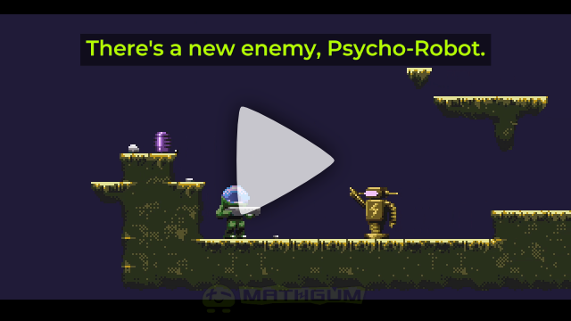
The first in line was a robot, or rather a Psycho-Robot, as we called it. Psycho, because it shoots in all directions, and you never know where its discharges will hit.
In general, we didn't really want to think about the plot and lore of the game, because we realized that we were making a logical game, where you would have to solve puzzles level by level with increasing difficulty. What's more: even the name was invented by chance. If you don't know Russian, you probably won't understand what "Chubrick" is. And if you are a little familiar, you'll realize that a chubrick is a little person we often see in meme comics. It's a usually abstract and fun character, or rather a "character unit". So, as you've realized, the "chubrick" here is exactly the main character to play as. But we moved this word to the end and called this strange word some ancient civilization (you know, like Chozo in Metroid). Stupid decision, right? Well, what's the big deal! By the way, the general name of "Space Takes" was also originally "Space Tales", but after googling, we realized that there is already such a game, so we decided not to repeat it. And later the word "Takes", it turned out, suits the meaning of the game even better.
Thus, we decided to forget about the plot altogether. However, we, among other things, love and respect the art of screenwriting, and even when watching a movie, we came up with a whole hobby of putting it into script blocks. So, as often happens with us, at this stage the plot began to suggest itself. And if it begins to be minimally traceable, then it is better to stick to it, so that the whole lore seems integral and did does not smell like nonsense.
But what's the plot here? Some planet with weak gravity, some weird robots - everything seems just random. But we automatically saw a minimal plot in everything that was going on and decided to make it official.
Level by level you have to pass to the next sectors, but the ancient civilization of Chubrick made sure that very stupid creatures do not visit them. They invented a pass system where you have to pick up relatively integer weights, combine them, and put them on a scale represented as a stone plate.
But what are robots doing here? Very simple. Humans recently discovered this planet and started exploring it, excavating, drilling a bunch of caves, etc. And all the robots are all mechanisms of humans, somehow related to the excavation. One day something went wrong and all the robots on the planet malfunctioned. The consequences of this failure were assigned to eliminate one of the contracted liquidators. This is indicated by the designation "LQQ-1701" (a little Star Trek Easter egg) with a change of the first three letters. If in Star Trek the first letters "NCC" meant "Naval Construction Contract", in our case the abbreviation "LQQ" means "Liquidation Quote Queue".
After realizing such a plot, we minimally outlined each robot's past. For example, the Psycho robot was given an electricity sign, which should give the player a hint that before the mass failure he was only a transformer box, and not at all spreading electricity in all directions.
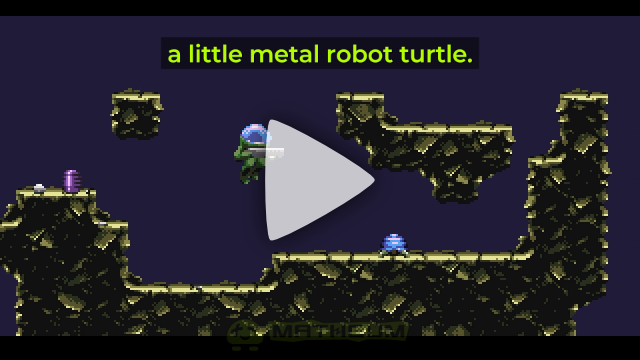
Next in line was a metal turtle, which appears to be some sort of container for carrying, most likely, something heavy like rocks. Unlike the metal bouncing ball, which is probably a courier for less heavy things like documents or small soil samples that need to be delivered much faster.
At the same stage, we had already remade the cliff tileset by compiling it automatically from 512 rules, the maximum number that takes into account the diagonal locations of neighboring tiles. We didn't use anyone's third-party plugins for Godot, but wrote our own script that autocompleted the tileset based on the filled cells, and according to the rules file, in which all possible variants for each of the 512 cases were manually prescribed. This was a lot of work, and maybe someday we will formalize this script and publish it for you. Unlike autotiling rules in Tiled and other programs, we think that our format of rules in the file is easy to understand. But first we would like to make a small utility for more convenient and quick compilation of these rules.
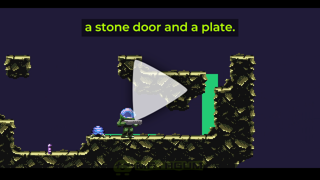
At the next stage we corrected the behavior of objects. But most importantly, we added a door and a plate, which could already be directly affected by weight mechanics. If the plate has the right weight on it, the door opens. If not, it closes. We feel like we'll add a few more weight-related puzzles, but for now it's just the most key one - the plate and the door.
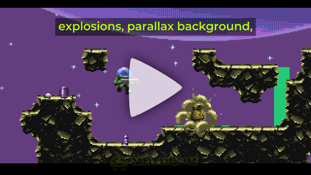
Eventually, we started to improve the visual part: adding backgrounds, effects, and so on. But the most important innovation was the menu. The game mode you've seen so far (run, jump, etc.) has been assigned a separate state out of several, just like the menu mode, and all the modes you might encounter in the game. Due to the fact that the game's canvas resolution is very low, at only 320x180 (this is even slightly lower than the resolutions of classic 90's games), designing the menus was not the easiest task. Especially when oriented on mobile devices. In the end, the best solution was to make the menu like in Doom 1993 - it is the most optimal.
For menus, touch zones should be set up correctly, all elements should have enough space and so on. And alas, there is not enough space because of our strange decision to render all sprites exclusively on a 320x180 canvas, so that all pixels were uniform in size and there were no sprites of different detail. We really dislike it when pixel sprites are freely rotated and scaled in games with native screen resolutions, obviously throwing off the polygons they are drawn on. This generates the "cardboard effect" as we called it. Such contrast is very stressful to the perception, for example, when on the background of huge pixels with low density suddenly appear sprites with increased density. Visually it looks very unpleasant, in our opinion. We have seen this phenomenon with flash games of the 2000s, which formed a firm impression of such graphics as garbage, despite the fact that on flash there were very good quality games. So we, as supporters of "pixel perfect" chose this method, but alas, it is not worth it. It's too hard to think about the menu design in such restrictions, so next time we'll do like everyone else. The main thing is to keep the pixel density uniform.
We hope we have told you something interesting. We will continue our story later.
In the meantime, you can download episode 1 and try it out. It will definitely still be finalized and filled with events, but we'll talk about it all later.
Get Space Takes: Chubrick Mysteries
Space Takes: Chubrick Mysteries
Sci-fi pixel art puzzle action-platformer in Amiga style
| Status | In development |
| Author | MATHGUM |
| Genre | Platformer, Action |
| Tags | 16-bit, 2D, Amiga, Atmospheric, Godot, Pixel Art, Puzzle-Platformer, Retro, Sci-fi |
More posts
- Update 2.0.0May 15, 2025
- Update 1.1.0Jan 08, 2025
- Final touches before 1st episodeNov 08, 2024
- First stepsOct 08, 2024
- LaunchOct 01, 2024

Leave a comment
Log in with itch.io to leave a comment.